The Unity Principle of Design
What is the Unity Principle of Design?
Unity is the principle of design that unifies all other principles within a piece of work, allowing each individual element to coexist with one another to form an aesthetically pleasing design. Ultimately, unity is what gives a design the appearance of cohesiveness despite its internal components differing in scale, contrast, or style.
A designer must leverage all of the principles of design in order to successfully achieve unity. This is done by assessing all of the elements within the design to better understand their relationships and how they interact with one another. In doing so, the designer is able to ensure that whether it’s a painting, poster, or web design, it is consumed as it was intended by the designer.
In short, unity is an agreement between parts that make up the whole. Unity is achieved when each individual element within a design comes together like a puzzle to reveal a singular cohesive vision.
The principles of design:
are a set of seven essential guidelines that help advise designers on how to produce a succinct and compelling piece of work each and every time. These principles include: Balance, Contrast, Emphasis, Proportion, Movement, Pattern, and Unity.
Each principle focuses on a key component of design and how its attributes effect the overall presentation of the work. In some cases, ignoring the principles of design can lead the audience to misinterpret the designer’s original intentions of the work.
Balance

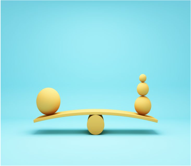
Image of a large 3D ball on one side of the scale in
balance with three smaller balls on the opposite side
Similar to a graph chart, a composition has both a vertical and horizontal axis. Designers must be aware of these axes as they lay out where they should place their key elements. The reason is so that each new element added to the composition includes its own unique visual weight.
Part of a designer’s job is to maintain equilibrium and designers will usually assemble their artistic elements in two ways: symmetrically, using the space on either side of the axis in the same way with objects that share very similar characteristics; or asymmetrically, where the space on either side of the axis is mismatched while still maintaining an equal visual weight.
To better understand balance, think about the layout of a webpage. It contains a variety of different pictures, icons, and font sizes. In order for all of these differently sized elements to work together, a designer will have to strategically think of how to lay them out in a way that is balanced and makes it easier to view.
Contrast

Image of a white 3D cloud in front of a solid blue background.
Most compositions include a variety of different and opposing elements. This can include a range of lighting, an assortment of colors, or even an array of textures. A designer can increase the contrast between two objects to highlight, for example, one being in the foreground and the other in the background. Using the same example, a designer can also reduce the contrast between the objects to visually place them at the same depth.
There are many ways that elements can contrast one another, which is why it is important for designers to understand how they oppose one another and also how to make those differences work in the overall composition.
with impaired vision.
Contrast is also used to differentiate the actions of buttons. A button that is used to save something will have a very different contrast than one that is used to delete. Without contrast in design, a user’s experience would become very frustrating.
Pattern

Naturally, as more and more elements are added to a composition, the likeliness of one or more being repeated increases. As these elements are repeated, a designer needs a way to organize them to bring a sense of semblance to the design. This effect is achieved by implementing a pattern that is visually consistent throughout the artwork. In more complex designs, multiple patterns will arise, and the designer will then have to consider how to best organize them to achieve unity with variety.
Why the unity principle of design is important
Unity is arguably the most important principle of design. It guides the designer on how to best leverage all the other principles to present a composition that is both harmonious and whole. Only when a designer has ensured that all other principles are working together is unity truly achieved.
Without unity, a seemingly complete design can feel unintentionally segmented, confusing, or in worst cases, unusable. A lack of unity can cause elements to compete with one another for emphasis, resulting in an experience that is contrary to the one the designer had originally intended. This can lead to the user feeling uncertain and confused.

Unity principle of design best practices
As designers’ skillsets mature throughout their career, they will inevitably create their own best practices that work for them to ensure their design meets the unity principle of design. Until then, here are some helpful best practices to start with:
- Whenever adding a new element, object, or component to a design, first decide what its relationship is with the others that already exist in your design.
- Take a step back from your design and assess: how do the design’s internal parts interact with one another?
- Create a checklist that includes all seven design principles and evaluate how each principle is being used in your design, and whether or not they are working together harmoniously.
- Have someone look at your design and then break it down for you. You will quickly discover whether the expected intent of your design is what people actually experience when looking at or interacting with it.
Unity (also called harmony) is an important principle of design that gives the artwork a sense of cohesion or coherence. It is the wholeness or completeness of a picture. Unity and harmony in art are used by artists to tie a composition together and help the composition make sense as a whole piece of art.
The principles of design are ways to organize the elements of art (line, shape, color, form, space, value, texture) to create a wide range of effects. To create unity or harmony in art, artists arrange the similar components and elements of art to create consistency. Unity or harmony can also be created by merging the form and the meaning of the artwork together.
Unity and variety in art are often discussed together, because ultimately an artwork must contain both unity and variety to be a successful work of art, and there must be balance between the two.